

Summary of Washington Color School
In the latter half of the 1950s, Washington D.C. saw a flourishing of abstract art that emphasized the form-making capabilities of pure color. Known as The Washington Color School, the loosely affiliated group of abstract painters knew each other through various teaching experiences. The moniker has an uncertain origin but likely originated with the title of a 1965 exhibition at the Washington Gallery of Modern Art, "Washington Color Painters," curated by Gerald Nordland. The show exhibited the works of Kenneth Noland, Paul Reed, Morris Louis, Howard Mehring, Thomas Downing, and Gene Davis. Additionally, Leon Berkowitz and Sam Gilliam along with V.V. Rankine, Alma Thomas, Hilda Thorpe and Anne Truitt were also associated with The School.
Using innovative techniques that expanded on Abstract Expressionist experiments with color and paint application, the Washington Color School created deceptively simple compositions that evoked dynamism and tension. Championed by the art critic Clement Greenberg as part of the larger trend of Post-Painterly Abstraction, the work of the group was seen as the culmination of modernist painting, with its emphasis on the two-dimensional surface of the picture plane and its lack of reference to any subject matter. The Washington Color School embraced the larger trend of Color Field painting, and some of its practitioners experimented with Hard Edge painting as well. In many ways, these D.C. artists anticipated the style of Minimalism and then evolved alongside it, and the teaching legacy of the Washington Color School left its mark on a generation of artists in Washington. While many saw these experiments as a way of moving out of and beyond Abstract Expressionism, others saw them as a formal dead end and divorced from the tumultuous atmosphere of the 1960s.
Key Ideas & Accomplishments
- The Washington Color School used color, and not drawing, to create and delineate simple geometric forms. They often spoke of wanting to put pure color on the canvas to create an immediate, all at once, visual experience for the viewer. This optical experience became more important than conveying subject matter.
- Many of the artists associated with the Washington Color School used a soak stain technique whereby thinned acrylic paint saturates the raw canvas. Instead of sitting on top of the canvas, the color becomes one with the canvas. Without the physical layers of paint, this technique emphasizes the two-dimensional nature of the picture plane, which according to Clement Greenberg was one of the main goals of modernist painting.
- As part of the larger trend of Color Field painting, The Washington Color School shunned the histrionic personas that had grown up around the Abstract Expressionist artists. Instead, the execution of their paintings were more anonymous, without the gestural presence of the artist. In downplaying the presence of the artist, the viewer's experience comes more to the fore. This switch in emphasis from the artist to the viewer was in line with other artistic experiments of the 1960s, including Happenings and Minimalism.
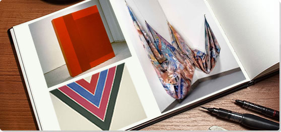
Key Artists


Artworks and Artists of Washington Color School

Beginning
Aptly named, this work marks the beginning of Noland's Washington Color School style. Its basic geometric form explores the lively effects of contrasting and complementary colors, depicted in concentric circles, centered on a square canvas. Noland eschewed representation and pictorial depth in favor of focusing on the relationships of the colors. Noland compared his painting to music, saying, "painting without subject matter as music without words." The slight irregularity of the circles and the outer ragged halo of black paint give the work a kind of spontaneous energy, while the circular form draws the viewer's eye back toward the hypnotic center.
Beginning exemplifies the artist's desire to create what he called "one shot" compositions. Noland's technique of staining the canvas meant that his paintings were extremely difficult to revise; what he put on the canvas had to stand as it was without second-guessing. Noland's "one shot" painting sought to overcome, in his estimation, the overworked compositions of the Abstract Expressionists. The Abstract Expressionists claimed that spontaneity was a cornerstone of their processes, but often their canvases were carefully built up over a period of time, sometimes years. Noland felt his paintings were truly spontaneous. As Greenberg wrote of Noland's circles, "His color counts by its clarity and its energy; it is not there neutrally, to be carried by the design and drawing; it does the carrying itself." The concentric circle on a square canvas became an iconic feature of Noland's work. In later works like Birth (1961), he reduced the number of colors, eliminated the penumbra effect, and regularized the concentric circles with hard edges, evolving his reductive approach.
Magna on canvas - Hirshhorn Museum and Sculpture Garden, Washington DC

Faces
This large canvas exemplifies Louis's Veil (1958-1960) series of paintings, each depicting a similar shape, rendered in translucent 'veils' or layers of magna paint diluted with turpentine. Rather than emphasizing a geometric shape like Noland, Louis creates a more organic form, not nested, but enfolded, while exploring color and transparency. As art historian Karen Wilkin explains, Louis and other Color Field painters believed "that a painting, no matter how apparently restrained, could address the viewer's whole being - emotions, intellect, and all - through the eye, just as music did through the ear."
Creating works like Faces in a very small studio, Louis began by stapling the 20-foot canvas to the wall, then pouring and manipulating streams of paint down the surface. Rather than the artist's brushstroke, the fluidity of the material, drawn by gravity to flow down the pictorial surface, is emphasized. The soak stain approach resulted in the colors melding with the weave of the raw canvas to create a diaphanous, layered effect. Through a veil of darker surface color, remnants of vibrant orange and green create a sense of movement. Relinquishing artistic control over the unpredictable results, Louis let the medium take on its own organic process to create the final result, as the paint itself became the subject. With this emphasis on the paint's own properties, Louis subverts the presence of the artist seen on the canvas, eschewing the unique gesture associated with Abstract Expressionists like Jackson Pollock and Willem de Kooning. Of the Veil series, Greenberg wrote, "The effect conveys a sense not only of color as somehow disembodied, and therefore more purely optical, but also of color as a thing that opens and expands the picture plane," and the art critic Michael Fried wrote, "the surfaces themselves...[spread]... with tremendous authority across the veil configurations as if in compliance with impersonal forces." These forces were to find analogous feelings within the viewer.
Acrylic resin (Magna) on canvas - Smithsonian Museum of American Art, Washington DC

Insurrection
This minimal and static object generates a dynamic energy that belies its simplicity. This large vertical sculpture, including the base, is divided asymmetrically into two shades of red, cleanly delineated from one another. As a result, the asymmetricality creates a kind of optical movement, with the dividing line both receding and projecting depending on one's perspective, and the two reds vie for foreground and background positions. Truit said, "Painted into color, this wooden structure is rendered virtually immaterial. The color is thus set free into space." Trained as a psychologist, she felt color had a psychological vibration, which could be clarified in an artwork, becoming an event, felt as a visual sensation.
Truitt, more than her colleagues in Washington D.C., felt more emotional resonances with the Abstract Expressionists' goals. Residing in Washington, D.C., Truitt's artistic breakthrough in the early 1960s was influenced by the work of Barnett Newman, particularly by his subtle color modulations in the blue double paneled work, Onement VI (1953). As she said of the gallery encounter with Newman's work, "I looked at them, and from that point on I was home free. I had never realized you could do it in art. Have enough space. Enough color."
While her work largely anticipated Minimalist sculpture of the later 1960s, she is more often than not, associated with the Minimalists. She herself insisted, however, "I have never allowed myself, in my own hearing, to be called a minimalist. Because minimal art is characterized by nonreferentiality. And that's not what I am characterized by. [My work] is totally referential. I've struggled all my life to get maximum meaning in the simplest possible form."
Acrylic on wood - The National Gallery of Art, Washington DC

Untitled
This square canvas, symmetrically divided into concentric squares and employing a color palette of speckled blue, orange, and violet, displays Mehring's interest in the surface of color. The basic geometric form of the square becomes, by repetition and variations in size, a complex arrangement of interlocking shapes that draws the viewer's eye to the center. The use of blue in the center of the composition creates dynamic movement, as the adjacent areas, broken up by purples and oranges, have a zigzag effect.
Unlike most of the Washington Color School artists, Mehring preferred to use thick pigments, creating a weight of luminosity. Each inch of the canvas becomes its own field of color, illuminated by specks of varying hues. As a result, while his work eschews the illusion of pictorial depth, the flat image takes on a dense but luminous materiality that sets his work apart from his Washington colleagues.
Acrylic on canvas - The Phillips Collection, Washington DC

Black Grey Beat
This painting, with its hard-edged stripes of equal width in different colors and shades, exemplifies Davis's emphasis on what he called the "color interval," the rhythmic effect created by the irregular appearance of color. Here yellow, red, green, and pink stripes pop vibrantly among black and grey stripes. Though the hard edge and uniform size of the stripes creates an orderly, almost calculated effect, the unpredictability of color creates the visual equivalent of jazz improvisation. He creates a complex schema of simplified forms to invite extended viewing and convey an unpredictable beat of spontaneity and play.
Considered a leader in the Washington Color School, Davis emphasized what the art critic Barbara Rose called the "primacy of color." Davis was also a relentless experimenter. He subsequently explored a variety of formats, including video, neon, collages, modular compositions, as well as what he called micropaintings, an inch square, and public installations like his Franklin's Footpath (1972), a stripe painting filling the street in front of the Philadelphia Museum of Art. His work brought a playful intensity to the abstract forms of color field painting. As art critic Paul Richards wrote, "[O]n the lintel of his doorway he would inscribe one word ...'Whim.'"
Acrylic on canvas - Smithsonian American Art Museum, Washington DC

Shoot
In the 1960s, Noland led the way as the Washington Color School moved toward a hard edge approach to their compositions. Having explored the concentric circle in hard-edged images like Birth (1961), he began to explore the chevron's V-shape, its straight lines of color outlined by thin lines of the neutral color of the canvas. The hard-edged, geometric form divides the canvas itself into triangles, two in neutral color on either side of the chevron's inverted triangular shape.
Noland explored the relationships of contrasting and complementary colors when adjacent to one another while, at the same time, exploiting a nested shape. As the apex of the chevron intersects with the lower edge of the canvas, a sense of energetic tension is created. The work itself becomes what Noland called a "color structure," where color determines the outer edge of the composition. Noland's chevrons draw attention to the tension between flatness and depth, foreground and background.
Acrylic on canvas - Smithsonian American Art Museum, Washington DC

Marmara
Reed titled this radically shaped canvas for a sea in Turkey. Trapezoids of various shapes in hues of red, orange, yellow, and brown surround a blue center, shaped almost like a key hole. Painted with matte and fluorescent pigment, the shapes create a sense of movement that lifts the overall shape off the wall, creating a dynamic, three-dimensional effect.
Reed's reference to Turkey, suggests that we are looking through an Islamic arch, abstracted to the geometric shape of the center blue, which was meant to reference a body of water. However, in essence, the abstract shape becomes an object without reference that seems to inhabit space, receding and advancing as it effects the viewer's perception. The work both exemplifies the 1960s hard-edged style for which the Washington Color School became known and emphasizes the sculptural possibilities of painting.
Acrylic on canvas - D. Wigmore Fine Art, New York, New York

Swing
With this innovative work, Gilliam stained then squeezed and folded a large sheet of canvas and hung it in draping folds. In doing so, he freed the color field from its frame. The work takes on a sculptural materiality, both organic in its folds and geometric in its four triangular points attached to the wall. Gilliam's intent was to make color move, taking on an intense physicality.
Dubbed "the father of the draped canvas," Gilliam began using unsupported canvas in 1965 and is credited with inventing the technique, inspired by watching laundry being hung on a clothesline. Deeply influenced by the jazz music of artists like John Coltrane, Gilliam expressed his artistic intent as to "just work and let things go," and he felt a painting should exist in real space, not separated from it by a frame. In the later 1970s, Gilliam fell out of the limelight, in part because as an African American artist, his abstract paintings did not speak directly to the plight of black Americans during the civil rights movements, and it is only since the first decade of the 21st century that his work is being reevaluated.
Acrylic on canvas, aluminum - Smithsonian American Art Museum, Washington DC

Sky Light
A crackled and interlocking field of blue shapes on white canvas exemplifies Thomas's mosaic approach to creating an abstraction of luminous color. While avoiding any illusion of depth, the surface is energetic with darker and lighter intensities of blue, outlined and lit up by thin outlines of white. In the flat pictorial plane, the varying shapes evoke both a finely fractured piece of colored glass and a fractal, where an organic shape dissolves into similar shapes on an ever-smaller scale. As a result, the field conveys a sense of infinity, which led art critic Ken Johnson to call her "an incandescent pioneer."
Thomas, an African American woman, turned to painting full time only in her sixties, after she had retired from teaching. Her earliest works, like Red Abstraction (1959), were Abstract Expressionist in style, but she soon became an energetic presence in the Washington Color School, evolving her own unique idiom of jewel-like colors and a kind of Byzantine mosaic effect. Though many of her works were inspired by what she called her "impressions of nature" and in the 1970s included her interest in space travel, her approach was profoundly abstract. Alma Thomas's work has garnered more recent interest, as Sky Light and two more of her paintings were displayed at the White House during President Barack Obama's administration.
Acrylic on canvas - Hirshhorn Museum and Sculpture Garden , Washington DC
Beginnings of Washington Color School
Precedents
The Washington Color School evolved from the Abstract Expressionist experiments with color and all-over composition. Clyfford Still, Barnett Newman, and Mark Rothko, sometimes referred to as Color Field painters, created bold compositions with large expanses of color. Clyfford Still created canvases with jagged areas of impasto color applied with a palette knife, and Newman punctuated large fields of color with vertical lines he called "zips". Rothko's vertically formatted canvases juxtapose rectangular areas of color that seem to float on the canvas. While the Washington Color School developed the techniques used by the Abstract Expressionists and adopted the new technique of staining, the artists tended to eschew the emotional and dramatic rhetoric used by the older generation.
Kenneth Noland
Kenneth Noland, as a teacher and artist, became the center of what was to become the Washington Color School. After serving in World War II, Noland took advantage of the G.I. Bill and enrolled at Black Mountain College, the storied avant-garde school, where he studied with Josef Albers and Ilya Bolotowsky and was introduced to the paintings of Piet Mondrian. After a year in Paris, Noland began teaching at the Institute of Contemporary Art in Washington, D.C. In 1950, he returned to Black Mountain College for the summer session where he met Clement Greenberg, the outspoken critic who championed Abstract Expressionism, who was also to play a prominent role in shaping and promoting the Washington Color School.
After his return to D.C., Noland continued teaching at Catholic University, where his students included Thomas Downing and Howard Mehring, and at the Washington Workshop Center for the Art, where he met and befriended Morris Louis in 1952. The two became close colleagues, and their subsequent collaborative efforts and explorations of the new "soak stain" technique advanced the development of the Washington Color School style.
Helen Frankenthaler and The “Soak Stain”
The criticism of Clement Greenberg and the work of Helen Frankenthaler were primary influences in the development of the Washington Color School. In 1953 Noland and Louis visited Greenberg in New York City, and he took them to Frankenthaler's studio, where they saw her newly finished Mountains and Sea (1952), a painting that launched her career when it was exhibited. Greenberg felt that Frankenthaler's work pushed beyond Abstract Expressionism in new and productive ways.
Frankenthaler uniquely transformed Jackson Pollock's method of pouring paint onto the canvas while it was on the floor. Her "soak stain" technique involved pouring oil paint thinned with turpentine directly onto the unprepared canvas. The color would then be absorbed, merging with the canvas, creating a luminous effect, like a halo or penumbra. With this process, Frankenthaler managed to make oil paint look like water color. Louis and Noland enthusiastically adopted the technique, and, returning home, they began to experiment, working together on the same painting, thinning paint to watercolor consistency and applying it to raw canvas. As Noland said of the process "Thin it, use it in the same way as dye. Thinness reveals color."
First Works: Veils and Circles
Unfortunately, none of the collaborative works that Noland and Louis created in their early experimentation with the soak stain technique remain, yet they each began to explore and apply related techniques at the time. Louis created a number of paintings that were described as "veils," or sometimes "florals." like Iris (1954). By 1956 Noland was creating "proto-circles," like Globe (1956), showing an irregular circle, reminiscent of an organic form. In these early works, Noland and Louis experiment with creating form with color and without delineations; that is to say, the forms created by the soft color abut one another without being outlined or otherwise differentiated.
Hard Edge Painting
In the 1950s, the works of both Louis and Noland evolved toward more definition, using regularized shapes, or hard edge simple geometric forms, with clean straight lines. Noland's proto-circles became simplified concentric circles like Beginning (1958). Louis's paintings were never as hard-edged as Noland's, but beginning around the year 1960, his poured color areas became more like delineated stripes with their edges less blurred, as in Where (1960).
Extensively connected to the New York City artistic community, the artists of the Washington group were familiar with Frank Stella's innovative Black Paintings (1959), canvases with parallel black stripes separated by thin exposures of bare canvas. Subsequently in the 1960s, the movement toward regularization and hard edge geometric shape gained impetus among the Washington School painters, as seen in works like Noland's Shoot (1964), Gene Davis' Hot Beat (1964) and Paul Reed's #1D (1965).
Post-Painterly Abstraction - 1964
In 1964 Greenberg curated an exhibition, Post-Painterly Abstraction at the Los Angeles County Museum of Art, which helped publicly launch the Washington Color School. Greenberg included paintings by Noland, Louis, Howard Mehring, Gene Davis, and Thomas Downing, along with painters associated with other movements like hard-edge abstraction and Color Field painting. Greenberg felt a painting's formal and non-subjective qualities were most important and sufficient to appreciate the work. In his accompanying catalogue, he did not so much define Post-Painterly Abstraction as posit that it was not the "painterly abstraction" of the Abstract Expressionists that had emphasized the gesture and the use of thick oil paints. As a result of Greenberg's exhibition and critical writing, Washington Color School Painting was seen as one of the primary trends in the new wave of abstraction.
Washington Color School: Concepts, Styles, and Trends
The Shaped Canvas
In the 1960s, a number of New York artists, including Frank Stella, were exploring the shaped canvas to emphasize the painting as an object inhabiting space. Among the Washington Color School, Thomas Downing, Paul Reed, Gene Davis, and Kenneth Noland all created a variety of works employing a shaped canvas. Davis experimented with the idea as early as 1952 when he had a lumberyard cut his Masonite panels into other shapes, but the compositions of those canvases had more in common with Abstract Expressionist surfaces, being built up with gravel to create texture and sculptural depth. In 1962, he was to return to the idea of a shaped canvas in works like Wall Stripes No. 3 (1962), in which seven differently colored stripe canvases were arranged horizontally on a wall, one on top of the other with a fixed distance between each.
The artist who most consistently focused on the shaped canvas was Paul Reed, as he built upon his earlier Satellite (1963) series that incorporated the wall into the pictorial space. Described by the art critic Barbara Rose as "checks of color unfurling in Arp-like shapes," the Satellite series consisted of a spinning organic shape on a large canvas with a "satellite," a smaller canvas with a related form and color precisely placed near it. Subsequently Reed began to explore further shaped canvases in series like Emerging, Topeka, Hackensack, and Zig-Fields, all painted in 1967. Other series were to follow, as he used more radical shapes, as shown in his Barcelona series (1968-1969)
Also, in 1965-1966 Thomas Downing employed his dot motifs in parallelograms and subsequently made works like Troll (1967), a complex shape that depicts two chevrons in a bended shape. Kenneth Noland first began using a diamond shaped canvas in 1964, as he turned his square canvas at a diagonal, perhaps influenced by Piet Mondrian's use of the diamond shaped canvas in the 1920s. In the 1970s Noland again took up the form, only using more complex shaped canvases, as shown in his Vault (1977), a painting that becomes a sculptural object.
Sculpture
Several Washington Color School artists explored the potentialities of color within sculpture. Experimenting in a variety of media, Helen Thorpe used gauze, balsa wood, glass, clay and metal, and included found objects in her pieces. Her most well-known works were her sculptures using handmade paper, like Edged Blue (1963). In the later 1960s, Paul Reed explored welded steel sculptures like Step (1966) that drew upon the clean line, geometric complexity, and modularity of his paintings.
Anne Truitt, however, was the only major sculptor associated with the school. Her artistic breakthrough in the early 1960s was influenced by the works of Color Field painters like Barnett Newman, as she saw the primacy of color could allow her new possibilities of expression. She said, "What is important to me is not geometrical shape per se, or color per se, but to make a relationship between shape and color which feels to me like my experience. To make what feels to me like reality." Living in Washington, D.C., her works were often shown at Pyramid Gallery, though she remained a more peripheral member of the group, in part out of her own individualistic approach. Despite Helen Frankenthaler's recognized role in the shaping of the Washington Color School, Truitt still had to negotiate the gender assumptions of the group, as Noland and Greenberg, in advancing her first solo exhibition in 1963, referred to her as "the gentle wife of James Truitt" and encouraged her to conceal her gender by dropping her first name. Her sculpture emphasized basic geometric forms, often a vertical rectangle made of wood, and a reductive color palette, as seen in works like Insurrection (1962).
Draped Paintings and Installations
In 1965, Sam Gilliam, a second generation Washington Color School painter who had studied with Thomas Downing, decided to set the canvas free of its frame. Soak staining twenty-foot long pieces of canvas, then twisting, folding, and shaping them before suspending them, he created works like Relative (1968) in which a vibrantly color soaked canvas hangs from a wall at four points, creating triangular shapes at the point of suspension and vertical lines of movement. Inventing this technique, he fundamentally redefined the relationship of the painting to space.
Installation work among the Washington Color School was primarily done by Gene Davis, as his stripe paintings were painted on streets and the steps of notable buildings. Davis painted 414 feet of the street leading up to the Philadelphia Museum of Art's in his Franklin's Footpath (1972). Later, in 1987, 8th Street NW in Washington D.C. was painted in color stripes in honor of Davis and the installation was recreated in Washington D.C. again in 2007.
Davis also created other installations employing different media, like his Sun Sonata (1983), a solar panel of color striped neon tubes installed outside Muscarelle Museum of Art in Virginia. Both his light installations and his stripe paintings in public spaces enlarged the scope of the Washington Color School art by making it part of cultural consciousness.
Later Developments - After Washington Color School
The Washington Color School's geometric, flat paintings and the sculpture of Anne Truitt influenced the development of Minimalism. As art historian James Meyer noted, Truitt's work also anticipated the work of Roni Horn and Félix González-Torres in the post-1990s. During the 1980s Neo Geo movement ironically reinterpreted the Washington Color School's geometrical compositions. Noland and other painters associated with the group influenced subsequent generations of abstract artists in the Washington, D.C. area, both by the presence of their work and their teaching. Contemporary artist, Mark Dagley acknowledges being "heavily influenced" by Noland, whom he called "one of the last great colorists of the 20th century." In 2000, curator Rita Bartolo said that Hilda Thorpe had "probably taught half of the artists working in the city right now."
Some of the Washington Color School artists fell into obscurity in the 1980s but have since been rediscovered. In 2007, a citywide event celebrating Color Field painting was held in Washington, D.C., and subsequently, the Washington Color School Project was created to promote the work of the group in 2011. Several of Alma Thomas's works were prominently displayed in the White House during the Barack Obama administration. Sam Gilliam's work has also risen to contemporary prominence and was featured at the 2017 Venice Biennale.
Gene Davis's work has had a long lasting artistic and cultural impact, as shown in the installation of his Sun Sonata (1983). Installed in 2008 on the William and Mary campus as the first "light painting" on campus, the university created an event where students would take silhouette shots in front of it. Contemporary artists Dan Cole and Polly Apfelbaum paired up for an exhibition For Love of Gene Davis in 2014 in Philadelphia, in which both explored their debts to Davis; Apfelbaum in her installation and Cole in his videos.
Useful Resources on Washington Color School
-
![Washington Color and Light at the Corcoran Gallery of Art]() 2k viewsWashington Color and Light at the Corcoran Gallery of ArtOur PickPBS News Hour / August 5, 2011
2k viewsWashington Color and Light at the Corcoran Gallery of ArtOur PickPBS News Hour / August 5, 2011 -
![Washington Color and School]() 0 viewsWashington Color and SchoolRobert Aubry Davis with Janice Goodman and Bill Dunlap / February 2, 2011
0 viewsWashington Color and SchoolRobert Aubry Davis with Janice Goodman and Bill Dunlap / February 2, 2011 - USA Artists: The New Abstraction: Morris Louis, Kenneth Noland (1966)Our PickBy National Educational Television and Radio Center; Indiana University, Bloomington. Audio-Visual Center


-
![Meet Sam Gilliam]() 24k viewsMeet Sam GilliamOur PickSmithsonian
24k viewsMeet Sam GilliamOur PickSmithsonian -
![Artist Anne Truitt on Her Work]() 5k viewsArtist Anne Truitt on Her WorkOur PickSimon and Schuster Books
5k viewsArtist Anne Truitt on Her WorkOur PickSimon and Schuster Books -
![Anne Truitt Perception and Reflection]() Anne Truitt Perception and ReflectionPBS NewsHour's Art Beat / October 2009
Anne Truitt Perception and ReflectionPBS NewsHour's Art Beat / October 2009 -
![Gene Davis]() 29k viewsGene DavisPhoenix Film and Video
29k viewsGene DavisPhoenix Film and Video


