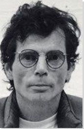

Summary of Richard Tuttle
One of the most lyrical and spiritually-minded of contemporary artists, Richard Tuttle has produced a body of work that is as difficult to categorize as it is intuitively pleasurable to engage with. Coming of age in the era of Conceptual and Minimalist art in North America, he took and contributed much to both movements, but incorporated a range of artisanal techniques into his practice - including printmaking and weaving - alien to the austere credos of his peers. The result is an art which is both esoteric and immediate in its appeal, both visually pleasurable and conceptually sophisticated, alluding to the everyday world of the materials used to compose it while simultaneously gesturing towards an ineffable or dreamlike plane of being only accessible through creative experience.
Accomplishments
- While many male artists of Tuttle's generation created works on an imposing scale - from Land artists such as Robert Smithson to abstract sculptors like Mark di Suvero - Tuttle's work has become a byword for smallness and humility (in spite of the huge scale of his 2014 I Don't Know piece). The use of humdrum, found materials to create works that would sit on a desk or in the palm of a hand, indicates an egalitarian streak, a love for, and celebration of, the everyday routines and the detritus of humanity.
- Working with organic and spontaneous-seeming visual and physical forms, a bright color palette, and a clear sense of the significance of artist's touch, Tuttle has moved decisively beyond the impersonal aesthetic of Conceptual and Minimal art. Indeed, it is possible to argue that he has brought an idea of 'soul' or 'spirit' to the methodical and process-based practices that grew out of those genres.
- Notwithstanding his sense of the social significance of his work - he has called the artist a "servant [...] of mankind" - Tuttle's practice is also marked out by a strain of esotericism. Describing art as a means of accessing 'the invisible', he has attempted through his work to gesture towards a plane of forms and ideas beyond waking experience, offering a series of related pronouncements leaning on a notion of hidden 'line' or language, as ambiguous and enticing as the practice they describe.
Important Art by Richard Tuttle

Purple Octagonal
Attempting to move beyond traditional painting methods through his early work, Tuttle began to consider the possibilities of the bare canvas. Purple Octagonal consists not of a canvas pulled across a rectangular stretcher and set behind a frame in preparation for the painter's brush, but an irregularly shaped, eight-sided canvas nailed directly to the wall. Unprotected, the canvas is intended to bend, fold, and crease when installed, moved, or placed in storage. The wrinkles in the fabric reflect this gradual process of wear and tear, a physical appearance which reflects the life of the work beyond the gallery. As viewers, we are invited to imagine the piece being removed from the wall and folded up, or taken down and replaced at a moment's notice.
While the gesture of presenting an artwork as the document of a process is exemplary of its time and place - New York in the 1960s - the processes which this crumpled, irregularly shaped object invites us to imagine are not the austere philosophical disciplines of Tuttle's Conceptualist contemporaries, but the routines of everyday life: eating, working, socializing. By presenting a piece of fabric which seems to bear the marks of regular and informal use, Tuttle establishes a conceptual link between the painter's canvas and the less precious fabrics which we surround ourselves with every day: above all else, the piece resembles a table-cloth. Tuttle's decision to hang the work with nails, and the scrappy, organic-seeming shape of the canvas, challenge the idea of the work's preciousness: we wonder if the sides were cut intentionally, or whether the shape has been assembled from discarded sections of existing frames. Has a scrap sheet of canvas been used?
Purple Octagon is an important early work, indicative of Tuttle's homely approach to Conceptual Art. Though he should no more be exclusively associated with this movement than any other, his invitation to ruminate on the rituals of the everyday bears the distinctive marks of conceptual subtlety and playful humility which characterize his practice.
Dyed Canvas - Museum of Contemporary Art, Chicago

Ten Kinds of Memory and Memory Itself
One of Tuttle's most controversial works, Ten Kinds of Memory and Memory Itself consists of a series of string 'drawings' laid out on the gallery floor. The work's appearance and method of composition reflect the artist's interest in line, relationships of scale, and the interplay between process and visual outcome. The piece is arranged on the floor through a series of movements that can be repeated to re-create the work in any context: Tuttle stands, sits, throws or stretches his body as the string is drawn, resulting in certain consistent patterns.
In one sense, Tuttle's string drawings give three-dimensional life to the lines of the abstract sketch. No longer restricted to the page, the work extends our sense of what a drawing might be made of, and the range of surfaces on which it might be made. We could almost see Ten Kinds of Memory as an abstract map, a series of topographical markings extending across the gallery floor. Its scale and horizontal placement enhance those associations, and also make the visual form of the piece highly subjective, dependent on the movement and positioning of the individual viewer. As regards the significance placed on compositional method, Tuttle again establishes a connection between visual form and compositional ritual which is in the spirit of much Conceptual and Minimalist art: the work becomes the index or evidence of the process used to create it.
While this work was harshly criticized when first shown at the Whitney in 1975 - in an infamous New York Times review, Hilton Kramer asserted that in Tuttle's case, "less is unmistakably less" - the polarized reception of Ten Kinds of Memory ironically put Tuttle on the art-world map. Indeed, his Whitney exhibition is now considered a defining moment in his career, when a coherent overall impression of his artistic style was presented for the first time.
String - Whitney Museum of American Art

New Mexico, New York #14
New Mexico, New York # 14 is one of a number of wall-bound low-relief works created with fir plywood. It consists of a simple, abstract, red-and-white painting on an irregularly shaped board which droops in the center. Hanging on the wall like a bent envelope, the piece is, like much of Tuttle's work, meant to look worn and crumpled, as if it had followed the artist around the country on the journey evoked by the title. The white line which swoops downwards from the top-left corner of the piece is both a visual marker and, perhaps, a conceptual marker of that same journey, looping back on itself as if to indicate the repetitive migratory patterns of the artist's life.
Like Purple Octagon, this is a work that seems at once abstract and oddly homely in its connotations. The thin line that runs across the top half of the painting is very much like an envelope flap, so the overall appearance of the work again reminds us of the banal props and material detritus of daily routine. The use of line in this piece is equally characteristic of Tuttle's oeuvre: unsteady, imperfectly rendered, it nonetheless has a peculiarly deliberative quality unique to the artist, which sometimes manifests itself in works that seem almost orthographic, as if they were made from the letters of an obscure script. Tuttle himself has stated that every artist has certain unique attributes, adding that "[o]ne of my attributes is a certain kind of line. It isn't a straight or singular line - it's almost a line of energetics."
Focusing on Tuttle's use of everyday materials, and on his works' resemblance to everyday objects, curator Connie Butler states that "[o]ne of the ways his work is extraordinarily generous is his incorporation of materials that are absolutely familiar to us, so familiar that they are invisible - the things we find littered around our desk drawers, that we would normally not pay attention to, are those things - those little orphans - that Richard rescues and incorporates into his work."
Acrylic on fir plywood - Pace Gallery, New York

Ink in Fiber
This work consists of a sheet of hand-made paper with a copper plate placed in its center, framing a red square, surrounded by a slightly larger square of spattered green ink worked into the fibers of the paper. The linguistic or literary connotations of the page as visual frame are typical of Tuttle's gestures towards the visual and sensory experience of engaging with written symbols, while the use of non-manufactured materials seems to reflect an investment in the touch or spirit of the artist, in contrast to the impersonality of many of his contemporaries' oeuvres.
Tuttle's interest in incorporating printmaking into his practice grew from a desire to combine an unusual range of materials and processes without any preemptive sense of potential outcome. In this case, the artist's decision to present ink in paper instead of ink on paper reflects a similar desire to push at the constrains of different compositional processes, as does his unusual combination of copper and paper, which gives Ink in Fiber its unique textural associations. The hard and soft of the copper and paper seem resolved through the mediating presence of the ink: as if the liquid were adhering the two materials to one other. The colors are subtler than in much of Tuttle's work, and suggest a connection to the natural world: the green of the ink seems like the green of the forest or field, the red like clay or earth.
Ink in Fiber is exemplary of Tuttle's mature work in its allusions to a diverse and unusual range of artistic and artisanal practices - from writing to printmaking to weaving to Conceptualism and Minimalism - and in the sense of warmth and intimacy which it conveys. Its allusions to literary or linguistic composition, meanwhile, are typical of his work which often presents an impression of working with an arcane, abstract language of some kind. This may partly reflect the influence of his wife Mei-mei Bursennbrugge, a significant poet associated with the L=A=N=G=U=A=G=E and New York Schools, and thus with the abstract edge of modern literary composition.
Hammered copper plate on handmade dyed paper - The Museum of Modern Art, New York

The Place in the Window #2
The Place in the Window #2 is one of seven sculptures created during Tuttle's residency at the Getty Research Centre in Los Angeles during 2012-13, comprising colored cotton fiber stitched into wire mesh. The mesh is shaped to create a series of rough rectangular forms, with breakages and loose wires generating that quality of visual spontaneity so characteristic of Tuttle's practice. While the materials and dimensions of the work suggest a sculpture, Tuttle's decision to hang it on the wall alludes to painting, the twined fibers reminding us of the bright, mixed pigments of an Abstract Expressionist painting.
Again, one of the striking qualities of this artwork is the way it appears to have been created by combining a range of distinct compositional processes, resulting in a sui generis form. The wire backing provides a 'canvas' on which Tuttle 'paints' with a palette of multicolored, fibrous strands, bringing associations of painting, sculpture, and mixed-media assemblage to the final work. This formal in-betweenness is perhaps part of what generates the work's dreamlike quality. It is difficult to tell precisely what materials have been used to create the piece, and how they are adhered to each other. What texture would this piece have if we touched it? What are its physical and structural qualities? Our inability to glean obvious answers to these questions is part of what seems to set the piece in a space subtly apart from waking reality.
At the same time, the Getty sculptures indicate another side to Tuttle's practice, one more rooted in real life. We sense it in his use of everyday materials and objects to construct his work, and in its subtle figurative suggestiveness. The warm color palette of this piece, with its sunset-like tonal harmony of reds, oranges, and purples, might remind us of the Getty's bright, hillside location in North Los Angeles. Indeed the title seems to present the piece as having been composed in a particular spot within the building, perhaps a "place in the window" with a view out across the vast city below. It is this impression of a love of the world as it is, and not only the more esoteric connotations of Tuttle's work, which give it its unique character.
Colored cotton fiber and wire mesh - Getty Research Center, Los Angeles

I Don't Know. The Weave of Textile Language
Created for the Tate Modern's vast Turbine Hall - the site of various iconic installation works since the gallery's opening in 2000 - I Don't Know is both the most publicly viewed artwork Tuttle has created and a piece which, ironically, eschews many of the characteristic traits of his practice. While much of his sculptural work is constructed on a miniature scale, this immense fabric-based sculpture, suspended dozens of feet in the air and stretching across and above the viewing space of the gallery, applies the principles which have long defined Tuttle's oeuvre on a grand physical scale. Towards the far end of the sculpture, the huge swathes of fabric, wrapped around a series of wooden circles, descend to the ground, lending a tangible sense of scale, and inviting the viewer, as it were, to ascend into the dreamworld of the artwork.
The scale of the piece is, undeniably, one of the most significant aspects of its visual form. Stretching through the hall, it makes the viewer newly aware of the relative smallness of their body. At the same time, its stated engagement with 'textile language' hearkens back to many of Tuttle's most long-held interests: fabric, weaving, and the idea of a 'line' or language underpinning non-linguistic forms of creation. Indeed, prior to the construction of the Tate Modern piece, Tuttle created a series of smaller fabric works for New York's Pace Gallery entitled Looking for the Map, which effectively served as studies for I Don't Know.
Tuttle's commission to fill Tate's iconic Turbine Hall reflects his status as one of the most celebrated and revered of contemporary artists. He has chosen to use this platform to present his works as paeans to the positive side of humanity, noting in an interview related to his Tate exhibition that "[i]f you made a list of great novels, symphonies and architecture, you could see the beauty of humanity, which is one of the hardest things to see right now. We're so critical, so competitive. We blame ourselves for ruining the Earth. A theme in the Pace show was the beauty of people."
Fabric and wood - Collection of the Tate, United Kingdom
Biography of Richard Tuttle
Childhood
At the age of five, Richard Tuttle realized the profound impact which art would have on his experience of the world. In an interview with curator Molly Donovan, Tuttle recalls sitting in his childhood living room and watching his grandfather draw from across the room, and being mesmerized by the harmony he sensed between "eye/brain, hand and heart/spirit." By his first day of kindergarten, Tuttle knew that he too would be an artist: when the teacher passed out paper and a box of crayons, he remembers, it felt like the first day of his life. He believes that spirit of the work he created as a very young child continues to surface throughout his practice.
Growing up in Rahway, New Jersey, Tuttle was often taken by his mother to the Metropolitan Museum of Art, where he loved viewing the Assyrian winged bulls. As he circled the golden sculptures, the young artist-to-be was amazed by how his movement around the figures seemed to change the number of legs they possessed. Tuttle cites this experience as an early example of his exposure to the possibility of accessing the invisible through art: its capacity to allow us into a hidden space, beyond everyday perception.
Although Tuttle always wanted to attend art school, his parents disapproved, and under familial pressure he decided to join the Air Force. His interest in flying, he later stated, stemmed from a desire to fly at twice the speed of sound; in a later conversation with the artist, Henry Geldzahler, curator at the Metropolitan Museum of Art, suggested that Tuttle had instead found a way of doing this by painting.
Early Training and Work
Despite his parent's disapproval, Tuttle ultimately went on to study art, philosophy, and literature at Trinity College in Hartford, Connecticut. The majority of his cohort were not concerned with contemporary art, but when the curator Sam Wagstaff visited his school, Tuttle recalls that pupil and mentor instinctively gravitated towards one another. Wagstaff taught Tuttle everything he had learned from the great scholar of Renaissance art Richard Offner, while Tuttle expanded his frame of creative reference by working on theater sets and editing a literary magazine. On graduation, Tuttle made the decision many young artists had made before him, and moved in 1964 to New York City. He worked as an assistant at the Betty Parsons Gallery, and after just a year of employment was given his first solo exhibition at the Gallery. One evening, Tuttle recalls seeing his drawing Hill from across the gallery space, and realizing that the piece was directly influenced by the first drawing he had made in kindergarten.
Through Parsons, Tuttle met the Minimalist artist Agnes Martin, who would become a close friend and mentor. Shortly after their introduction in 1964 Tuttle purchased one of her drawings, a work which he still owns today. He has stated that Martin's tenacious energy allowed her to embody the intuitive approach and 'all-over' compositional style of Abstract Expressionism while simultaneously spearheading the next significant movement in modern art, through her repetitive, line-based drawings and paintings.
Mature Period
In 1975, Tuttle's first survey exhibition was held at the Whitney Museum of American Art, curated by the critic and gallerist Marcia Tucker. The exhibition focused heavily on Tuttle's non-traditional 'drawings' composed from string laid out on the floor, and received such negative reviews that Tucker was fired for overseeing what critics deemed "a pathetic attempt to master [the gallery's] vast empty space." Despite these carping assessments, both artist and critic would go on to find acclaim, with Tucker opening the New Museum for Contemporary Art in 1977, and Tuttle now recognized as one of the most significant North-American artists of his generation.
Since his 1975 exhibition, Tuttle has built up a body of work defined by its depth and diversity. Hard to pin down to any one movement or stylistic categorization, his practice has evolved a visual language all of its his own. Using everyday materials - string, graph-paper, wire mesh, bubble wrap, cardboard, plywood - Tuttle creates intriguing works in which conceptual rigor and formal effervescence meet. In sharp contrast to the tendency of his male contemporaries to employ raw industrial materials on a grand scale - see Mark di Suvero's calligraphic use of steal I-beams, or the granite biomorphic forms of Isamu Noguchi - Tuttle's poetic sensibility finds expression in delicate, ephemeral works often no larger than paper-weights. As art writer Paul Gardner puts it, "the idiosyncratic Richard Tuttle offers an intimate, more philosophical vision that turns the concept of an impersonal practice upside down."
Speaking about what drives his work, Tuttle often refers to his interest in defining the 'invisible'; using visual, tangible forms to hint at the forms that lie just beyond the thresholds of our sensory perception. This near-spiritual pursuit is reflected in works not intended to be perceived exactly as they are, but as gestures towards hidden forms and presences. It is perhaps for this reason that some of his works seem underwhelming on first encounter. For an early exhibition at the Whitney, Tuttle placed a number of small works around the gallery, including a coffee stirrer with a touch of paint on its tip exhibited by itself on a 40-foot wall. Reputedly, a guest approached Tuttle and said, "Mr. Tuttle, do you have any idea of the cost of real estate in this part of town?" , an anecdote which capture's Tuttle's dedication to playfulness, and his ability to use and occupy gallery space in ways people had never considered before. Curator Connie Butler recalls seeing his small works presented close to the skirting board of the gallery, occupying a completely new display space, in a way that encouraged her and other viewers to readjust their visual and physical response not just to the art but to the gallery itself.
Current Work
Today, Tuttle splits his time between New York City, Abiquiú in New Mexico, and Mount Desert, Maine, travelling with his wife, poet Mei-mei Berssenbrugge. Partly as a result of their time in New Mexico, Tuttle has become interested in so-called 'vibrational medicine', an alternative therapeutic system which holds that the human body takes on three forms: the physical, the "etheric", and the "astrospheric" bodies, affirming Tuttle's belief that human beings are "in fact mostly light." Despite these esoteric beliefs, Tuttle continues to hold, as he has throughout his career, that art first and foremost serves society. In reference to a 2005 retrospective exhibition of his work held at the San Francisco Museum of Contemporary Art, Tuttle spoke of defining a new genre of art that "aspires toward a total living art that people can use to make their lives better." In particular, Tuttle is an advocate of the capacity of art to heal: "I believe society is natural, and nature tries to heal itself, to become healthy, just as we individuals would turn towards being healthy. I see art as a part of that whole procedure."
When in New York, Tuttle continues to visit the Metropolitan Museum of Art once a week, citing the Met as a tremendous accessible public resource.
The Legacy of Richard Tuttle
During the early part of his career, Tuttle was amongst various artists, now associated mainly with Conceptualism, who shifted public perceptions of what art could be, in both physical and conceptual terms. No longer restricted to categories such as 'painting' and 'sculpture', art - Tuttle's art - could instead be the document of a process or thought, a simple form perhaps constructed from very simple materials, but which gestured towards something ineffable, beyond the physical boundaries of what was presented. As curator Robert Rainwater puts it - using the language of the Conceptual art critic Lucy R. Lippard - Tuttle 'dematerialized' art, making the concept conveyed as significant as the physical or visual content of the artwork. At the same time, there is a visual warmth and homely materiality to much of Tuttle's work. We recognize its constituent materials as we walk around our homes and neighborhoods, performing our daily rituals. This evident love of the quotidian counterbalances the philosophical imperatives of Tuttle's practice, resulting in a body of work that is both inviting and intriguing to the viewer.
In spite of his sociological aims, Tuttle's legacy is largely within the world of 'high art', with his works bought and sold at high prices and regularly exhibited at major museums and galleries. Art critic Michael Kimmelman states that "many younger artists today revere him almost as a shaman. Much of the work you see in galleries now - installations of hum materials, low-key abstractions, spare Zen-like interventions of one sort or another - owes a debt to him." Artists influenced by Tuttle's work include Jim Hodges, Sarah Sze, and Thomas Hirschhorn.
Influences and Connections


![Thomas Hirschhorn]() Thomas Hirschhorn
Thomas Hirschhorn![No image available]() Jim Hodges
Jim Hodges![No image available]() Sarah Sze
Sarah Sze

-
![Agnes Martin]() Agnes Martin
Agnes Martin ![No image available]() Mei-Mei Berssenbrugge
Mei-Mei Berssenbrugge
-
![Post-Minimalism]() Post-Minimalism
Post-Minimalism -
![Conceptual Art]() Conceptual Art
Conceptual Art ![No image available]() Contemporary Sculpture
Contemporary Sculpture

Useful Resources on Richard Tuttle
- Richard Tuttle: Making SilverBy Richard Tuttle
- The Art of Richard TuttleBy Richard Tuttle and Madeleine Grynsztejn
- Agnes Martin & Richard Tuttle: Religion of LoveOur PickBy Agnes Martin and Richard Tuttle
- Richard Tuttle: Whitney Museum of American Art, New York, September 12-November 16, 1975, Otis Art institute Gallery of Los Angeles County, Los Angeles, January 16- February 29 1976By Marcia Tucker and Richard Tuttle
- Richard Tuttle: PrintsBy Chris Dercon and Joachim Homann


