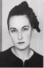

Summary of Carmen Herrera
Though the story of a 103-year old Latina woman painter achieving fame in the final years of her life after selling her first painting at the age of 89 is a captivating one, Carmen Herrera's story is worth telling primarily because of the quality of her work, and not because of the unique, stranger-than-fiction circumstances of her discovery. Born in Cuba in 1915, she has lived as an émigré in New York for most of her adult life, producing crisp, clean works of abstract geometrical minimalism that nonetheless seem to hum with warmth, wit, energy, and life. Having worked in relative isolation from - though by no means in ignorance of - milieus and movements for most of her life, it is not clear whether we should call her a Concrete Artist, an Op Artist, a Hard-Edged Abstractionist, or some other, more finely nuanced term. What is clear is that her work has fed on - and fed back into - all of the most enriching currents in twentieth-century abstract minimalism. She is a modern artist of considerable significance.
Accomplishments
- Based in New York during the heyday of Abstract Expressionism, Herrera's crisp, classical style was an ill fit for her home-scene, closer in spirit to the work being produced across the continent by the painters of California's Hard-Edged Abstraction school. When that movement began to diffuse itself more widely - through the discovery of New York artists such as Frank Stella in the 1960s, for example - Herrera's creative identity perhaps began to fit its locale more clearly. Nonetheless, her emphasis on harmonious color combinations, and her interest in subtle and whimsical figurative suggestion, marks her work out from many painters to whom the "Hard-Edged" label is attached.
- Likewise, we might interpret Herrera's work in relation to Op Art. Based in Paris in the late 1940s when that movement was taking off in that city - through the work of Victor Vasarely and others - many of Herrera's works produce the same effects of optical dazzle that made artists such as Bridget Riley famous during the 1950s-60s. Again, however, it is hard to judge the extent of Herrera's interaction with the Op Art scene, and the inspiration she drew from it, because of her own unique circumstances.
- Herrera's clinical and clean style of draughtsmanship can be connected to her brief time as an architectural student during the late 1930s. She reportedly makes many preparatory sketches for each work she produces, working with a methodical rigor that reflects her grounding in the craft of architectural drawing. Her persistent interest in architectural space and city-scenes also seems to reflect this aspect of her creative education.
Important Art by Carmen Herrera

A City
This painting, ambiguously entitled A City, was created during a key phase of Herrera's life, while she was living in Paris following the Second World War. Herrera has since commented of this time: "[i]t was about meeting new people and gaining a new set of influences and learning to filter and absorb those. Everything was marvellous; everything was possible". The sense of possibility and excitement is fully apparent in this work through the jostling shapes, colors, and forms.
In this painting as in many others, Herrera seems to combine her love of abstract space with the careful planning and composition of an architectural drawing. Her time as an architect was extremely influential, not just in terms of the aesthetic of straight, clean lines, but also the training it gave her in drawing and planning. For every painting, Herrera makes dozens of drawings before setting on the final structure. In this picture, that planning process manifests itself in a sense of carefully harnessed energy. Shapes seem to jostle against each other, and the painting feels spontaneous and lively, ironically as if it were the work of a quick, spontaneous process.
This sense of formal energy, combined with what is surely a visual reference to the Eiffel Tower on the left of the canvas, seems to evoke the multiplicity and excitement of urban experience. The contrasting blacks, blues, and yellows suggest different times of day, as if expressing the experience of living and being in the city across a stretch of time. In its allusion to key features of the Parisian landscape and incorporation of the frame around the picture, the painting may also make a subtle nod to Robert Delauney's earlier, avant-garde homage to Paris, Simultaneous Windows on the City (1912).
Writer and novelist Claire Messud notes of this painting: "[m]ore visually complicated than her later paintings, it evokes, with its sharp juxtaposed turrets of light and dark overlaying broken oblongs of opposing color, the architecture and bustle of urban life. It is hard not to smile at Herrera's witty use of the rectangular burlap frame and within it, the squared oval of tri-colored paint, which in turn contains the measured interplay of various geometrical forms." In evoking the city landscape, as Messud identifies, Herrera demonstrates the powerful language of shape and form, which can communicate so much with such simplicity.
Acrylic on burlap - Whitney Museum of American Art, New York

Iberic
Many of Herrera's earliest paintings were created on round canvases. In this form the painting therefore has no 'frame' as such, but instead seems to frame itself, through the quality of self-containment that circular forms, unlike rectangular forms, are able to bring to the picture-space. In fact, the idea of framing this piece would seem inherently paradoxical, especially because the title, Iberic, a synonym of 'Iberian', signifies an interest in the landmass of Iberia (modern-day Spain and Portugal), thus asking questions about belonging and identity to which there are no definitive answers. Identity, Herrera suggests, like artistic form, cannot be put in a box.
The lack of frame, that is, which might be read as imposing an organizing principle on the shapes contained on the canvas, puts the question instead to the viewer: how do these shapes fit together? And who decides what they mean? The subtly orthographic qualities of many of those shapes -their likeness to written symbols - further heightens the air of enigmatic or buried significance. Taken in the context of the title, these questions seem redolent with issues of self-identification. As a woman of Hispanic origin living as an expatriate in New York and Paris, Herrera wrestled with questions of belonging. This canvas presents that quandary as one without end or solution, but worth pursuing nonetheless.
This is also one of Herrera's earliest works to establish a compositional approach which would serve Herrera throughout the remainder of her career. As the curator Dana Miller notes, "[t]he interaction between forms of solid, unmodulated color (taken straight from the tube or can of paint) became the predominant subject of her work and remains so to this day." The oranges, blacks and reds of this painting indeed constitute blocks of uniform color, but the shapes are various, and seem to fall in and out of harmony with each other. It is this sense of energy and tension, achieved with a minimum of compositional elements, that ensures the value of Herrera's work.
Acrylic on canvas - Collection of the artist

Untitled
In this stark painting, black and white lines traverse a canvas bisected by a jagged line, splitting the frame into two sets of triangles. It is a bare, almost violent image, in which precise sharp edges generate a counter-intuitive sense of vibration and movement. Herrera seems to be exploring the very process by which the viewer makes sense of shape and color on the canvas, pointing to their active role in constructing the final image in their own mind.
The obvious point of reference for such work is the post-war Op Art movement which, like Herrera's oeuvre itself, emerged substantially out of post-Constructivist groupings based in Paris in the post-1945 years. It is notable that the Hungarian artist Victor Vasarely, himself famous for producing similar works of black-and-white optical dazzle, was establishing his mature style in Paris in the late 1940s during Herrera's time there (though there is no apparent evidence of their interaction). Nonetheless, like Vasarely, Herrera manages to imbue a work constructed purely from straight lines and blocks of monotone color with a sense of lively, almost magical energy. But whereas Vasarely's style emerged partly from scientific explorations into the process of ocular cognition, for Herrera, these Op-art-esque works were achieved through a more practical series of experiments, and served to celebrate the process and potential of composition. As she has remarked in interview, "[t]here is nothing I love more than to make a straight line...It's the beginning of all structures really".
Dana Miller points out that there is often little evidence of Herrera's hand in her paintings (another key point of similarity with Op Art). In the exacting lines she produces, Herrera is perhaps questioning the role of the individual artist in a new age of technological precision, wondering how and where the mind behind the work can and ought to express itself. The subtle nod to a city-scape or urban and industrial space in the suggestion of jagged roof-lines also bespeaks her love of design and urban life, and her sense of the creative potential of the architectural drawing.
Synthetic polymer paint on canvas - The Museum of Modern Art, New York

Blanco y Verde
Like Untitled (1952), this striking painting is created from two colors arranged into simple shapes, and yet the longer one gazes at the image, the more complex and suggestive it become. Herrera would go on to make an extended series of works based on the motif explored in Blanco y Verde, all of them in green and white, and based around the intersection of verticals and gentle diagonals shown here.
As Dana Miller comments, this work is "indebted to [Herrera's] fascination with three-dimensional structures". The intersection of the two lines (leaving a small and enigmatic gap at the point of convergence) and contained spaces they create, filled with a simple but verdant green, take on a series of expansive yet enigmatic associations: a landscape with receding fields, perhaps, or the interior or exterior of a building, even sunlight breaking over a horizon. The most interesting aspect of the piece formally speaking, however, is that neither green triangle allows the eye to fully settle on the perspective and three-dimensional arrangement suggested by the other. None of these associations therefore holds sway and the piece remains, as its title suggests, an arrangement in white and green.
Herrera's compositional skill is thus in ample evidence in the Blanco y Verde series, again reminding us of her particular genius for exacting and organised yet formally playful canvases. In spite of its few elements, nowhere on the canvas do we encounter mere blank space; instead, Herrera shows just how imaginatively transformative geometric minimalism can be.
Acrylic paint on canvas - Collection of the Tate, United Kingdom

Dos
Though Herrera primarily works on canvas, she has always been interested in sculpture and sculptural forms. This piece, part of her Estructuras series, explores the creation of shapes and the formation of space (and of further shapes) as their inverse. Some of the other pieces in this series stand alone on the floor, but this piece is hung on the wall, and therefore provokes a series of questions about the characteristics of, and boundaries between, different artistic media and compositional elements. Is this a sculpture or a painting? Are the gaps created between the two structures integral elements of the composition or just blank space? How does our sense of the weightiness of, and friction between, the two affect our sense of them as shapes?
As in her earlier works, then, Herrera seeks to emphasise the interplay and interdependence of different elements of an artistic composition, not allowing us to engage with any one shape or aspect of the piece in isolation from the others. At the same time, might we be missing more figurative, homely, even sexual connotations? The title, Dos or "Two", suggests the presence of two figures: figures in friction, perhaps, lying down, embracing, and kissing. The imperfect correlation of the shapes in this case may become a coded comment on the nature of human intimacy. The piece was, itself, created with the aid of a collaborator, a carpenter whom Herrera hired after receiving a grant to support her work. She has spoken since of her desire to create further "structures" such as this one, though her erstwhile collaborator has since died.
Like many artists whose work embraces aspects of Op Art, Herrera has long been working at the boundaries of painting and sculpture through her visual formultations of three-dimensional form within two-dimensional composition. Works such as Dos in a sense show the natural extension of this interest in sculpture, as well as her versatility and creative adaptability as an artist.
Acrylic on wood - Maria Graciela and Luis Alfonso Oberto Collection

Blue Monday
This painting is from a series that Herrera worked on between 1975 and 1978 entitled Days of the Week. In this series, Herrera connected different color combinations and shapes with different days, suggesting that, despite the clean and clinical abstraction of her work, as an artist she has a strongly intuitive feel for shape and color, connecting them to the most basic aspects of her - and our - feeling of being in the world.
These paintings, as much as any others in her oeuvre, partly show Herrera's connection to the movement of Hard-Edge Abstraction that had, by the early 1960s, spread east from its point of origin in California to her home-city of New York. New Yorkers such as Frank Stella had been selected for inclusion in the Second-Generation Abstraction exhibition held at the city's Jewish Museum in 1963, which was seen to have significantly advanced the style and movement. In this sense, Herrera's local art-scene perhaps became more conducive to her own cool, classical style, and the stark, bare feel of this painting may reflect the relationship between her work and the Hard-Edged school. However, it is worth pointing out that Herrera remained more interested in color harmony than color opposition - which had been explored in key Hard-Edged works such as Frederick Hammersley's Opposing #15 [1959] - and that the title once again anchors the piece in subtly figurative and emotive suggestions (is this a rain-drenched city-scape, for example?)
Again, we can also sense an interest in creating ephemeral illusions of three-dimensional form that places her work primarily in the company of Op Art. The upwards diagonal stroke to the left of the canvas, the main point of formal interest in the piece, seems to stretch both away from and towards us, leaving it, as it were, gyrating in mid-air with a subtly disconcerting effect perhaps evoking early-week malaise.
Acrylic on canvas - Collection of the artist

Rondo (Blue and Yellow)
An example of a relatively-late work employing Herrera's signature round-canvas style, Rondo is more structurally complex then it may first appear. It is made up of various shapes that seem to sit apart from each other even as they form elements of a larger whole. Like earlier works, this sense that different aspects of the painting will not quite sit still next to each other creates a peripheral sense of flicker or movement between different iterations of the overall form, almost tricking the eye, into believing that the central diamond shape is emerging from the center of the canvas.
We are perhaps used to seeing such effects in the work of Op Art artists such as Vasarely and Riley. What is remarkable is that Herrera worked for so many years at the cutting edge of developments in post-Constructivist, Concrete, and Optical Art with so little acknowledgement. In this case, she also brings a unique musical association to the Op Art mode, the term "Rondo" referring to a movement in a musical score based around a recurring lead melody. This suggests a playful awareness of the painting's capacity to present repetitive visual rhythms to the viewer, while the roundness of the canvas is perhaps a nod to the circularity of the musical motif represented.
At the same time, works such as Rondo are notable for the pronounced sense of color-harmony that they express. The critic Edward J. Sullivan comments that '[i]n Herrera's paintings, color cannot be separated from form. One embodies or promotes the importance of another within a given composition." As so often in Herrera's work the interaction of color also suggests figurative or naturalistic themes (in this case perhaps nautical ones - might we be looking at a sail on a horizon at sunset?)
Acrylic on canvas - Whitney Museum of American Art, New York

The Way
In this work created in her 103rd year, Herrera again explores the imaginative possibilities of elementary color and shape combinations. Like the green triangles in her Blanco y Verde series, the red lines on this canvas nearly touch, as if the arrangement were both drawing them together and keeping them apart. Again, the work teaches us how much of artistic form is constructed through our own perception, as the lines also seem to enclose, at either corner of the canvas, raised and perhaps minutely off-white rectangles.
Some of the most interesting work of this painting is done by the conjunction of image and title. Does "The Way" refer to a route through a city or building, for example? In this case, we might read the red lines as paths on a diagram or map, or part of an aerial cross-section of an urban landscape. This reading would certainly reflect Herrera's lifelong interest in architecture. At the same time, the overall visual effect may be of a crucifix, in which case "The Way" might indicate a path to spiritual enlightenment. Herrera was born and raised Catholic, and has kept her faith throughout her life, filling her house with religious iconography. By this reading, Herrera shows that abstract work can follow in a long line of religious painting, including work by the Baroque painter Francisco de Zurbarán whom she counts as an influence.
Perhaps, finally, and like all of Herrera's work, her title alludes to "the way" in which painters (and viewers) are able to work with a minimum of compositional elements to create a wide range of imaginative themes and forms. In this case, the title is about how we understand and read art: Herrera seems to suggest that there isn't simply one way, but many possibilities.
Acrylic on canvas - Private Collection
Biography of Carmen Herrera
Childhood and Education
Carmen Herrera was born in Havana in 1915, the daughter of two journalists. Her father established the newspaper El Mundo, where her mother worked as a reporter. As the youngest of seven children, Herrera's house was busy and chaotic; as only one of two daughters, she had to fight to assert herself. She showed an early aptitude for art, so when she was eight, she and her older brother Addison were given private lessons by Federico Edelmann y Pinto. A well-respected painter and teacher, Edelmann y Pinto had established several art institutions in Havana, including the Association of Painters and Sculptors, and an annual Salon for the artists of the city. He was her first point of contact with the artworld, and his teaching was at the root of her lifelong passion for painting.
The political beliefs of her parents led Herrera to be taught in schools that followed the work of non-traditional educators like Maria Montessori, though she was also taught at Catholic school for a time. At the age of 14, Carmen was sent to finishing school in Paris, where, along with lessons in manners and etiquette, she received a thorough introduction to art history. Paris would become a city of central importance for Herrera's work.
When she returned to Cuba at the age of 16, Herrera found the country in upheaval. She wanted to attend the Academia Nacional de Bellas Artes San Alejandro, but this would have meant breaking a strike enforced by students protesting the violence of Gerardo Machado y Morales's authoritarian regime. She instead attended a progressive women's cultural club called the Lyceum, where she studied painting, sculpture, and drawing. Though styled as a 'club', the Lyceum was an important base for pro-democratic, feminist, and culturally adventurous voices in 1930s Cuba, and there Herrera met many other artists; she was particularly influenced by the folk-inspired avant-garde artist Amelia Peláez. Herrera exhibited her own work for the first time at a group exhibition organized by the Lyceum in 1933, held at the Círculo de Bellas Artes.
In 1938 she enrolled at the Universidad de La Habana to study architecture. Though she only attended for one year, her studies had a profound effect on her, and the influence of architectural theory can be sensed across her entire oeuvre. Herrera herself noted that at the university, "an extraordinary world opened up to me that never closed: the world of straight lines, which has interested me until this very day". The processes of preparing architectural drawings became fundamental to Herrera's artistic practice.
Mature Period
In 1937 Herrera met Jesse Lowenthal, an American teacher who was travelling through Cuba as a tourist. They kept in touch after he left, and a romance developed. The two were married in 1939, and Herrera moved into Lowenthal's New York apartment. Aside from a period of a few years in Paris, Herrera has lived in New York ever since.
In 1941, Herrera received a scholarship to the legendary Art Students League of New York, where she was taught by the Regionalist-esque Realist painter Jon Corbino. Herrera never quite settled at the school, and was particularly disillusioned by its emphasis on figurative painting over other media such as wood-block printing and sculpture. She lacked an artistic milieu, and longed for a group of supportive artists with whom she could discuss work and collaborate. Her relative lack of success at this time was brought to the fore when she was not asked to contribute to an exhibition of work by Cuban artists held at MoMA in 1944.
It was only after moving to Paris in 1948 that Herrera found a group of artists able to inspire her. Though New York was beginning to establish itself as the hub of contemporary developments in modern art, artists from all over the world continued to flock to the more established art-world center of Paris during the post-war period, and the city sustained a vibrant cultural life both day and night. Herrera and her husband became friends with writer Jean Genet, who was himself friendly with many figures in Paris's literary and artistic circles. Carmen finally started to consolidate her own minimalist-abstract style, having discovered the work of precursors such as Kazimir Malevich and a supportive group of contemporaries including Axel Wilmar and Jean-Michel Atlan. Her connection to the Salon des Réalités Nouvelles - where she exhibited between 1949-52 - gives some clue as to the artistic lineage she discovered in Paris. The Salon des Réalités Nouvelles was the successor to the Abstraction-Création group, the main outlet for post- Constructivist, Concretist, and anti- Surrealist tendencies in 1930s Paris, boasting members such as Piet Mondrian and Naum Gabo. Herrera thus took up her place in a line of minimalist abstract artists stretching back to the De Stijl, Neo-Plasticist and Constructivist movements of the 1910s.
It is also interesting to note, given the Op Art style of much of Herrera's work, that Op Artists such as Victor Vasarely were developing their mature style in Paris at this time.
In the early 1950s, Herrera travelled to Cuba, where visited her family and painted. She staged a solo show in December 1950 hosted by her former club the Lyceum, but the exhibition received relatively little attention. This led Herrera to conclude that Cuba was not yet ready for her work (although a budding Concrete Art scene was emerging elsewhere (yet quite far) in Latin America, with the formation of the Asociación Arte Concreteo-Invención in Buenos Aires in 1945, for example, and the Grupo Frente in Rio de Janeiro in 1952). She found a somewhat different situation in New York, where she and her husband returned in 1954. Abstract Expressionism had become the dominant method in the city's art-scene, and she befriended artists including Mark Rothko and Barnett Newman. Still, her own work did not flourish, partly because it was in a more austere, rational style than the emotionally-charged abstraction of the famous New York painters, but more primarily because of her gender. Whereas more Hard-Edged Abstractionists like Leon Polk-Smith found a limited audience for their work in New York despite its relative distance from the dominant modes, Herrera continued to be excluded from galleries and exhibitions. On one occasion, her friend, the gallerist Rose Friend, on rejecting Herrera's work, told her outright it was because she was a woman. Herrera has since noted that "[a] Latin woman, painting in the manner that I did stood no chance".
In 1967, Herrera created her only full architectural design, a mausoleum for her dying brother. Though the building was never constructed, her sketches demonstrate many of the concerns that her artworks had always expressed, such as the relationship between different kinds of space, and the combination of formal simplicity and playful energy.
Later years
In 1985, at the start of her seventh decade, Herrera staged her first major solo show, at the Alternative Museum in New York. This important museum, which aims to show the work of artists interested in social and political issues, has aided the careers of many artists over the years, including the Body Artist Hannah Wilke and the controversial photographer Andres Serrano.
It was only after many years of painting and working that Herrera began to be recognized for her work. She sold her first painting aged 89 in 2004; the sale signalled a shift in her career, and she was soon lauded as one of Cuba's greatest undiscovered secrets. Herrera has remained sanguine about her late discovery, noting in one interview: "when you're known, you want to do the same thing again to please people. And, as nobody wanted what I did, I was pleasing myself." It is interesting to draw comparisons with the recent late successes of other women artists such as Rose Wylie and Lubaina Himid, whose work, like Herrera's, was for a long-time appreciated by a relatively small group of art-world initiates.
Herrera's husband died in 2000 at the age of 98. The two never had any children, living togetherfor 61 years. The couple were close, and Jesse was extremely encouraging of his wife's talent and dedication to painting.
Herrera's first European solo show came in 2009, at Birmingham's Ikon Gallery. The show was a roaring success, and went even further in establishing her as an important and inventive figure in twentieth- and twenty-first-century minimalist abstraction. In 2015, to celebrate Herrera's 100th birthday, a documentary about her was created by the American filmmaker Alison Klayman, known for her 2012 film on the Chinese artist Ai Weiwei. Klayman became interested in Herrera after meeting her when she was 98, and wanted to explore the contrast between her developed and confident artistic voice and her treatment and experience as an immigrant, Latina artist.

In 2016, the Whitney Museum hosted a retrospective of Herrera's work covering the period 1948-78, with other galleries across the world following suit. With the aid of her assistant, the Puerto Rican artist Tony Bechara, Herrera continues to produce work into her 100s, and may well be the oldest-living, important contemporary artist.
The Legacy of Carmen Herrera
The legacy of Herrera's work is difficult to trace, not only because she is still living but because she worked in relative obscurity for so many decades. Engaged with abstraction and minimalism at the same time as many better-known artists, we can place her in the company of various international movements, including North-American Hard-edged Abstraction - practiced by contemporaries such as Ellsworth Kelly - the late vestiges of Concrete Art movement in 1940s-50s Northern Europe, the Parisian Op-Art movement, and the Brazilian Neo-Concrete movement established in 1959, involving women artists such as Lygia Clark and Lygia Pape. But unlike many of the figures just named, Herrera's work was little viewed at the time, and so it is difficult to say precisely who was inspired by it. It is possible that Kelly himself, an artist eight years younger than Herrera who was interested in the same pared-down style, saw some of her work in New York and Paris.
Suffice it to say, Herrera's status as a central figure in modern art will be further solidified in the years to come. As the curator Dana Miller writes, "the totality of her more than seventy years of creative output is a stunning body of work that places Herrera firmly in the pantheon of great post-war abstract painters alongside the likes of Ellsworth Kelly, Agnes Martin, Barnett Newman, Ad Reinhardt and Frank Stella." Moreover, Herrera's influence has already spread to the world of fashion. Albert Kriemler, creator of the Swiss brand Akris, cited Herrera as an influence on his Spring 2017 show, using several of her paintings to form the basis of prints on a wide range of clothing.
Herrera's legacy also lies in the example of her late-blooming career. Like other women artists such as Louise Bourgeois, her life has been dedicated to art, but she did not find an audience for her work until she was very old. Her legacy, then, is not just about her painting but about her tenacious creative perseverance in the face of an indifferent, oar biased, world.
Influences and Connections


-
![Wifredo Lam]() Wifredo Lam
Wifredo Lam -
![Barnett Newman]() Barnett Newman
Barnett Newman -
![Mark Rothko]() Mark Rothko
Mark Rothko ![Leon Polk Smith]() Leon Polk Smith
Leon Polk Smith![No image available]() Amelia Peláez
Amelia Peláez


-
![Cubism]() Cubism
Cubism -
![Constructivism]() Constructivism
Constructivism -
![Concrete Art]() Concrete Art
Concrete Art -
![Abstract Expressionism]() Abstract Expressionism
Abstract Expressionism ![No image available]() Japanese Art
Japanese Art


-
![Barnett Newman]() Barnett Newman
Barnett Newman -
![Mark Rothko]() Mark Rothko
Mark Rothko ![Leon Polk Smith]() Leon Polk Smith
Leon Polk Smith![No image available]() Axel Wilmar
Axel Wilmar![No image available]() Jean-Michel Atlan
Jean-Michel Atlan


