
Summary of Ed Ruscha
For over 50 years, Ed Ruscha has delivered wryly detached portraits of the ephemera of our lives, found deeply embedded within various subcultures, most notably that of Southern California. Through his lens, familiar imagery such as specific architectural gems, common motifs within consumer culture, or font-specific words elevated as objects are bestowed an iconic status. His fodder is often garnered from the environments in which he lives and works, pulling in a mixed bag of visuals from the film and advertising industries as well as a thriving vortex of trends and memes stemming from an area often noted for being the birthplace of "cool." Ed Ruscha is the quintessential Los Angeles artist whose work catapulted Pop art from a form that merely highlighted the universal ordinary into a form in which the ordinary could now be viewed in relation to its geographically intrinsic cultural contexts. In his hands Pop becomes personal.
Accomplishments
- Rather than simply painting a word, Ruscha considered the particular font that might add an elevated emotion to the meaning much like the way a poet considers a phrase. By painting a word as a visual, he felt he was marking it as official, glorifying it as an object rather than a mere piece of text.
- Ruscha's skewing of everyday objects with a twist spurs the viewer to look at something ordinary in a new light. This can be seen in his trompe l'oeil word paintings in which oil paint resembles common viscous fluids or, with a touch of humor, in his paintings of LACMA and Norm's - two Los Angeles institutions, both of which he depicts licked with flames.
- The ever-present influence of Hollywood and media machines can be seen in the way Ruscha paints his solitary subjects upon the overall space of the canvas plane. Bold, large words or images floating on vast singular backgrounds mimic the opening screens of movies or fleeting glimpses of roadside billboards that must catch an audience's attention in one compelling instant.
- Ruscha's homage to the ordinary monuments of our lives, seen all around us but typically relegated to background noise, extends beyond the canvas. As seen with his book Twenty Six Gasoline Stations and others, he offers a deadpan look at the common and humble elements that float on our periphery, presented as a form of simple documentation rather than pristine art subject. This furthers the idea of Pop art as a vehicle for pulling out the mundane from its obscurity within our collective consciousness.
- Ed Ruscha believed that photography's potential lay in its use as a means of communicating information and ideas, breaking new ground in his use of the medium for Conceptual Art despite his disinterest in photography as a fine art. Ruscha often arranged his images in groups or sequences presented as books and this approach, exemplified in Twentysix Gasoline Stations, influenced the use of seriality and typology by later artists including Bernd and Hilla Becher and Taryn Simon.
- Ruscha's photography frequently took the American vernacular as its subject, showing the United States as it was encountered in everyday post-war life. Ruscha sought to avoid romanticising his subjects and approached them with an emphasis on concept over representation, arguing that the artwork was almost complete before the images were even taken. Artists including Stephen Shore, Lewis Baltz and Joel Oppenheim drew from Ruscha's approach, capturing everyday environments and breaking compositional rules, combining his conceptual innovation with consideration of photography as an art form.
Important Art by Ed Ruscha

View
View is a collage that acts as a commentary on photography's role in the post-war United States. The central focal point is a silver gelatin print of a painting by Joe Goode, one of Ruscha's housemates, depicting a star above three stripes. This painting, unframed, is photographed against a grey backdrop. This image is mounted with photo corners onto a piece of black paper, which occupies the bulk of the frame, and the word 'VIEW' is written above the painting at the centre while '1960' and 'OCTOBER' provide two additional lines of handwritten text below. This collage is completed by its frame, which is gold and wooden, and by the paint splattered across the glass.
Ruscha differed from contemporaries such as Andy Warhol and Robert Rauschenberg in his decision to take his own photographs, rather than using found images, but has frequently dismissed photography as a fine art. Ruscha uses photography as a tool for communication rather than as an end in itself; his emphasis on the organisation of images, through collage or in books, has been tremendously influential. View subtly alludes to ways in which photography was encountered in the mid-century USA, with the black-and-white image of Goode's painting suggesting the reproductions through which art students often encountered canonical works and the photo corners attaching the photograph to the black paper suggestive of a family photo album; this combined references to fine art alongside casual snapshots serves to question the ways in which audiences relate to images and their means of circulation. The splatters of paint across the glass, meanwhile, draw attention to the constructed nature of the photographic image, emphasising the surface as a screen rather than a window into the world. Ruscha used a Yashica 2 1/4 camera to make View and developed the central image in a basement darkroom shared with his housemates; Yashica cameras, requiring the photographer to look down toward a mirror rather than directly at a subject, emphasise the distance between photographer and subject, and this is echoed by Ruscha's treatment of Goode's painting, which is abstracted, flattened and deemphasised as it is transformed into a compositional element.
Mixed media on paper - Whitney Museum of American Art

Boss
Ruscha claims that Boss was his first mature painting. It was the first of a long series of word paintings where Ruscha created single-canvas works each featuring a word with strong connotations and a powerful visual impact. Later versions included Honk, Smash, Noise, and Oof. Ruscha later stated that the word "boss" "was a powerful word to me, and it meant various things - an employer, and a term for something cool. Also, a brand of work clothes." Ruscha uses this multiplicity of meaning to encourage the viewer to consider all the subconscious connotations of the word. This could be expanded to an exploration of the subconscious meanings hidden in all forms of language. Art historian Margit Rowell argues that looking at Boss is similar to looking at a billboard from a car window, which is not dissimilar from watching the opening screens of a movie.
Ruscha used thick layers of oil paint to create Boss. His use of impasto and dark-brown and black paint gives the word a heavy visual weight as an image-object as well as a linguistic signifier. It also has what Ruscha has called "a certain comedic value," since there is an element of the surreal or the absurd about placing so much emphasis on a commonplace, mundane word. The painting doesn't take itself too seriously, and is playful as well as thought provoking. Ruscha later said of his work, "I'm dead serious about being nonsensical."
Oil on canvas - The Eli and Edythe L. Broad Collection, Los Angeles

Twenty Six Gasoline Stations
This 48-page booklet entitled Twenty Six Gasoline Stations was inspired by Ruscha's journeys to Oklahoma City from Los Angeles, a road trip he made several times a year to visit his parents. He claimed that the gas stations he encountered along the way became "like a musical rhythm to me - cultural belches in the landscape." He took photographs of the gas stations, stopping the car across the road and getting out to capture them.
He would take the photographs quickly, trying to avoid deliberate or artful compositions, resulting in an anti-artistic style that was to become highly influential with photographers in the future. This deliberate rejection of traditional art photography was intended to make his audience think about why they ascribed aesthetic value to particular visual conventions. He said, "people would look at it and say, 'Are you kidding or what? Why are you doing this?' That's what I was after - the head-scratching."
Although they were taken on journeys, there is no narrative to the final series of images. Instead they have a detached, documentary quality. Critic and director of the Getty Museum Timothy Potts describes them as "deceptively simple," pointing to a deliberate aesthetic choice by Ruscha.
The book was originally released in a self-published edition of 400, which Ruscha sold for $3 each. Building on his experience working with a printing company, he utilized his skill in typesetting and photo offsetting in order to print the book using a professional printing press. The resulting small paperback booklet, with its everyday and unglamorous subject matter, was a deliberate alternative to the glossy, expensive books created by other artists.
Paperbound booklet - J Paul Getty Museum, Los Angeles

Large trademark with eight spotlights
Large Trademark with Eight Spotlights is an 11ft-wide painting featuring the 20th Century Fox logo, a well-known image from the beginning of many Hollywood films. This is one of several pieces that deal with the culture of Hollywood in Ruscha's Los Angeles. The wide format recalls widescreen movies in the cinema, or the shape of advertising billboards. The logo is presented as if in the opening credits of a movie, seen from below, as if the viewer were looking up at a large sculptural version of the logo. Laurence Goldstein explains how "Ruscha thumbed his nose at 'good' art composition, by pushing the massive trademark and its backdrop of searchlight beams to the far left. Our eyes are trapped and held there."
In this painting, as in much of Ruscha's work, the words of the trademark have been reified, turned into a three-dimensional object much like the famous Hollywood sign. The boldness and three-dimensionality of the words points to the overwhelming prominence of Hollywood in Los Angeles in the 1960s, and of particular brands or "trademarks" within the Hollywood industry, some of which Ruscha felt were becoming almost synonymous with the movie industry itself. He is neither wholly celebrating nor wholly condemning the consumerist culture of Hollywood, but rather painting an image of the industry as he sees it: powerful, exciting, brand-oriented, and ubiquitous. Although Ruscha's presentation is intended as ambiguous, an ambiguity that is sometimes argued as rendering contemporary art meaningless, it still elicits a mixed response within the viewer in which preconceived ideas about the subject are confronted and either validated or challenged.
Oil, house paint, ink, and graphite pencil on canvas - Whitney Museum of American Art, New York

Norm's, La Cienega, on Fire
"Norm's" is a beloved 24-hour roadside diner located in La Cienega in Southern California. This painting is one of a series in which Ruscha depicted local landmarks on fire, including a gas station and the Los Angeles County Museum of Art (LACMA). The fire in Norm's, La Cienega, on Fire is stylized, almost like something you might find in a cartoon or graphic novel. The contrast between the striking red flames and the blue sky makes the fire appear melodramatic and slightly surreal; it is deliberately eye catching but doesn't portend any real danger. The striking diagonal line that breaks up the painting adds to this effect, and makes use of one of Ruscha's favorite compositional tropes, also used in paintings such as Large Trademark with Eight Spotlights (1962). The diagonal wedge also creates an image of the diner as it might be seen from a car speeding past at night.
For Ruscha, diners in Southern California such as Norm's had become visual icons. For him, they were symbols of a particularly American culture and landscape. This is evident in the painting's title, in a play on words typical of Ruscha; the diner's name, "Norm's", points to its normality and its role as the "norm" within everyday American life. By depicting it on fire, Ruscha's painting acts to "torch" those "norms and standards," as critic Michael Darling puts it, but it also acts as a celebration of those norms. This paradoxical approach is typical of Ruscha's work.
Oil and pencil on canvas - The Broad, Los Angeles

Annie, Poured from Maple Syrup
This piece is a prime example of Ruscha's endeavor into trompe l'oeil style work in which he takes a widely-known word or concept and paints it as if it were made of a viscous liquid, seemingly poured directly onto canvas and made to seem three-dimensional through his meticulous use of shadow and light. Annie was the name of a little orphan girl, a central character in a namesake popular movie of the time, who stole the hearts of America. By painting the name as if it were made of bright orange maple syrup, Ruscha presents a characterization of the text as vibrant, sweet, and warm. It also lends a surreal slant on a totem of popular culture.
Oil on canvas - Norton Simon Museum, Pasadena

Every Building on the Sunset Strip
This book, folding out to twenty-seven feet, records every building on both sides of Los Angeles's Sunset Strip. Designed as an accordion foldout, the south side of the street extends from east to west along the top of the book while the north side is rendered upside down along the bottom, as if the central space in which addresses and names of cross streets are recorded were the road itself. Each structure has been photographed separately; the images are collaged together with an emphasis on documenting the buildings, with vehicles in the foreground often cropped abruptly. Ruscha's survey begins with Schwab's Pharmacy and a Chevron gas station at the corner of Laurel Canyon, scrolling past motels, liquor stores, restaurants and an art gallery, among other sites, before finishing at 9171 Sunset Boulevard, close to the corner of Cory Street. The buildings are photographed from a frontal perspective and appear flat, with few shadows that would otherwise allow the viewer to get a sense of their three-dimensionality.
Ruscha has described Every Building on the Sunset Strip as a "historical archive" and it can be seen as a demonstration of his belief that photography was best used as a means of communicating information. In this book, buildings are displayed without emotion and without hierarchy; each is given equal attention and photographed, in the same unstudied way, by a 35mm camera mounted atop a car. The Sunset Strip was, at this point, seen as emblematic of Los Angeles and Ruscha, as occurs often in his oeuvre, plays with the city's mythology and reality, depicting it as simultaneously unreal and underwhelming. Ruscha's portrayal of the Sunset Strip unfolds cinematically, with the viewer encountering images in sequence, as if in the passenger's seat of a car. His portrayal of the buildings as two-dimensional, encountered only through their facades, similarly recalls the film industry for which Los Angeles was and is known, appearing as false as structures erected to serve as backdrops. Every Building on the Sunset Strip also anticipates postmodern theorisations of the city; a few years later, Denise Scott Brown and Robert Venturi would film the act of driving down the Las Vegas Strip as part of their investigations into the significance of vernacular architecture for Learning from Las Vegas (1972). Every Building on the Sunset Strip, like the earlier Twentysix Gasoline Stations, was immensely influential, encouraging a generation of photographers, prominently including Lewis Baltz and Stephen Shore, to capture the USA as they encountered it, minimising attempts to idealise or construct.
Offset lithograph - The Getty Research Institute

Dance?
In the 1970s, burdened with a temporary malaise toward working with oil paint, Ed Ruscha began working with non-traditional and organic materials to create his artworks. He explained, "the first work that I did involving vegetable matter and organic materials came out of a frustration with materials. I wanted to expand my ideas about materials and the values they have."
But beyond a simple experimentation with medium, his use of food materials in work such as 1972's Dance? also contributes to the overall meaning of the piece which is atypical of other Pop artists who merely used traditional tools to elevate everyday words or objects. His application of coffee, condiments, and even cheese, reflected the genuine foods that might be served in a common American diner of the time. This, in conjunction with the single word Dance, the popular pastime of the day, colored in the hues of imagery and fashion of the 1970s, imparts a full immersion into the very experience Ruscha wishes to convey. The question mark eludes to the variety of options readily available in a consumerist society. He has said that "all my artistic response comes from American things", and this particularly American sensibility is evident in Dance? The painting also reflects Ruscha's constant engagement in contemporary culture.
Coffee, egg white, mustard, chili sauce, ketchup and cheddar cheese on canvas - Collection of the Tate, United Kingdom

Pretty Eyes Electric Bills
As well as experimenting with non-traditional materials, in the 1970s Ruscha made a series of "catch-phrase" drawings, where phrases are overlaid onto colorful backgrounds. In Pretty Eyes Electric Bills from 1976, the words "some pretty eyes and some electric bills" are set against a field of sky blue pastel. A tension is created between the lettering and the background. The pastel blue is soft and hazy, maintaining evidence of the artist's hand. Otherwise, the text is set in rigid typography using the tools of graphic design. This juxtaposition of art and design points to Ruscha's attempt to break down the distinction between the two disciplines, and between high culture and low culture, in a way that is typical of the aims of the Pop art movement.
The two halves of the "catch-phrase" are also highly incongruous: the first half is evocative of romance and beauty, while the second half refers to mundane household nuisances. Ruscha later stated, "Pretty Eyes, Electric Bills is my way of separating two subjects that are on the far end of the world from each other. This somehow gets to be the reason that I want to make a work of art of this discord." The inclusion of the word "some" in both halves of the phrase acts as a qualifier, but has the effect of making the entire phrase even more vague. The sense of mystery evoked by this is deliberate, and points to Ruscha's aversion to straightforward messages or "morals" in his works. Instead, his aim is to make the viewer consider every aspect of his work more closely.
Pastel and graphite on paper - Collection of the Tate, United Kingdom

Pay Nothing Until April
Later in his career, Ruscha started to explore landscapes that were alien to his Los Angeles home, and from the 1980s he began to work on a series of paintings where he presented landscape views superimposed by text. Here, snow-capped blue mountains sit against a yellow sky, while the incongruous phrase "Pay nothing until April" is overlaid in the foreground. The piece was created by spraying the canvas with an initial layer of paint, before building it up further with mid-sized brushstrokes. He said of the project, "it's not a celebration of nature. I'm not trying to show beauty. It's more like I'm painting ideas of ideas of mountains. [...] Mountains like this were only ever a dream to me."
The relationship between the text and the mountain landscape seems mysterious or inharmonious. In this way, Ruscha invites the viewer to consider both the everyday phrase and the background more closely as they try to ascertain the connection between the two. The phrase "pay nothing until April" echoes the language of advertising, where customers are encouraged to commit to a product now but not pay for it until a later date. The painting is about the size of a shop-window travel poster and the combination of words and image may conjure an advertisement for a ski holiday or airline flight. The font, which is clean and modern, was designed by Ruscha and is intended to indicate what he described as a "no-style". The painting points to a view of the world, which is detached and distant, and compels the viewer to accept that logical connections can't be pre-supposed.
Acrylic on canvas - Collection of the Tate, United Kingdom
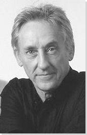
Biography of Ed Ruscha
Childhood
Ed Ruscha was born in Omaha, Nebraska to a Roman Catholic family that included his father Edward, mother Dorothy and siblings Paul and Shelby. His father worked as an auditor for an insurance company and his job took the family to Oklahoma City, where they lived for 15 years. Although Edward was very religious and strict, Dorothy was a lover of music, literature, and art, and introduced her children to these features of high culture.
Ruscha's artistic talents developed at a young age. He particularly enjoyed drawing cartoons, an interest he maintained for many years. Although his mother supported his decision to apply to art school, Ed's father was unhappy about the idea. Though, when his son gained a place at Chouinard Art Institute in California, he changed his mind because he had read that Walt Disney often offered well-paid jobs to its graduates.
Early Training
When Ruscha moved to Los Angeles in 1956 to attend Chouinard, (now known as the prestigious California Institute of Arts), he was instantly attracted to the Los Angeles lifestyle. He later recalled, "They had a hot-rod culture here, they had palm trees, they had blonde beach bunnies in the sand. There was progressive jazz happening at the same time. All of that added up to a possibly attractive future." He dove into the lifestyle and got involved in editing and producing "Orb", an art and design journal.
While he was studying in LA, his father died. His mother Dorothy decided that she needed to expand her horizons so after Ruscha graduated, he went on a trip to Europe in the summer of 1961 with his mother and brother. They traveled for four months, buying a small car in Paris and using it to visit countries all over Europe. Ruscha visited museums, but found he wasn't gripped by the art of previous centuries. Instead, when he returned to Paris at the end of the trip, he spent time walking through the streets and painting local signage, such as those above the Metro stations.
After returning to Los Angeles, he worked for the Carson-Roberts Advertising Agency designing layouts. He also started to pursue his career as an artist seriously at this point. His teachers had trained him to "face the canvas and let it happen, follow your own gestures, let the painting create itself." But he eschewed this direction as well as the prevailing Abstract Expressionism of the time to instead find his own style, which drew on popular culture and his love of the city. He later said, "I could see I was just born for the job, born to watch paint dry."
Mature Period
In 1962, Ruscha was invited to show his work as part of the "New Painting of Common Objects" show at the Pasadena Art Museum, curated by Walter Hopps. The show is generally credited as the first museum exhibition in America showing what would later be dubbed Pop art. Ruscha, the youngest artist in the group, showed his work alongside pieces by Roy Lichtenstein, Jim Dine, Joe Goode, Wayne Thiebaud and Andy Warhol.
The following year, Hopps invited Ruscha to put on his first one-man show at his commercial gallery, the Ferus Gallery, where Andy Warhol had presented his first solo show in 1960. The show was a success and Ruscha sold six paintings. The same year, Hopps organized a large Marcel Duchamp retrospective, an artist who had greatly inspired Ruscha's thinking. Ruscha attended the opening of the exhibition, and had the opportunity to meet Duchamp in person, an experience he greatly valued.
In 1965, Ruscha met his future wife, Danna, an animator for Hanna-Barbera. Described by friends as being vivacious with a warm smile, Danna married Ruscha in 1967. Their son was born the following year, and was named Eddie after his father. During this period, Ruscha was also earning money from working as a layout designer for the magazine Artforum, but he used the pseudonym Eddie Russia to submit his work.
Ruscha was a childhood friend of guitarist Mason Williams, and the pair remained close throughout their lives. In 1968, Ruscha was asked to paint an image for the cover of Williams' record Music. The credit on the album took an ironically apologetic tone: "Sorry, cover by Edward Ruscha". Living in Hollywood, Ruscha inevitably got to know several actors and filmmakers. For example, the comedian Steve Martin's first significant art purchase was a print by Ruscha, which he bought in 1968 for $125. A few years later, Martin decided to see how much he could sell it for and a dealer told him: $625. This experience and a love of contemporary art inspired him to start a large collection, which heavily featured Ruscha's work, and the pair became friendly.
In the early 1970s, Ruscha experienced a crisis of confidence in his painting. In 1972 he was recorded as saying, "I can't bring myself to put paint on canvas. I find no message there anymore." That same year, Ruscha separated from his wife and the couple eventually got divorced. Ruscha's interest in painting revived soon after, and he subsequently had several relationships with other women. He dated models such as Lauren Hutton and Leon Bing, and had a long relationship with actress Samantha Egger, with whom he lived in the early 1980s. Later in the decade, he met up with his ex-wife Danna again, and the couple rekindled their relationship. They decided to get married once more in 1988, choosing the chapel in Las Vegas that they had used for their first wedding.
Ruscha's first major retrospective was held in 1982 at the San Francisco Museum of Modern Art. For the exhibition catalogue cover, he chose a drawing made in 1979, which features the words "I don't want no retro spective". Ruscha's work became popular with Japanese collectors entering the contemporary art market in the late 1980s, suddenly driving up demand for his work. He later joked that he had become a "twenty-five year overnight sensation."
Current Practice
Ruscha continued to produce work on a prolific scale throughout the 1990s and early 2000s. When his original dealer Leo Castelli died in 1997, Ruscha was taken on by art-world mogul Larry Gagosian. This catapulted his reputation, as an important international artist outside of Los Angeles, made evident by his inclusion in the 2005 Venice Biennale, where he showed his Course of Empire, a series of ten large-scale paintings. This increased fame coincided with a resurgence of international interest in Los Angeles as a major center for the art world.
Ruscha continues to work two or three days a week in a concrete-built house in the California desert, which he had designed by Frank Gehry in 1976. He describes the house as "pretty remote - a three-hour drive, and the only other house out there is a mile away."
The Legacy of Ed Ruscha
Ed Ruscha is now seen as a Made in L.A. artist, with his borrowing from popular culture and his evocation of the landscapes of the city and its surroundings. Working as part of the Pop art movement, his work was to influence a younger generation of artists, particularly Neo-Pop artists such as Jeff Koons. Furthermore, Ruscha's creation of canvases featuring single words were to influence other artists such as Martin Creed, whose text-based projects have a similar impact. His work also has a lot in common with conceptual text-based practices developed in the 1960s by artists such as Lawrence Wiener and Joseph Kosuth.
Ruscha's artist books, such as his Twentysix Gasoline Stations (1962), have also been highly influential. Artists have responded to his books on an international scale over the last 60 years, including Bruce Nauman, whose Burning Small Fires (1968) consisted of a series of photographs of the artist burning a copy of Ed Ruscha's artist book Various Small Fires and Milk (1964).
Influences and Connections


Useful Resources on Ed Ruscha
- Ed RuschaBy Richard D. Marshall
- Ed Ruscha: PhotographerBy Margit Rowell
- Ed Ruscha's Los AngelesOur PickBy Alexandra Schwartz


